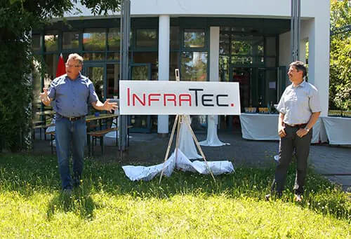
InfraTec presents redesigned Logo
InfraTec GmbH renews its appearance and with immediate effect operates with a redesigned logo. In comparison to its predecessor, the new signet has a considerably fresher, more modern and, at the same time, timeless look. “The impression places a stronger emphasis on the technical orientation of the company,” explains Matthias Heinze, Managing Director of the infrared sensor division. “It illustrates our further development since the foundation of the company 25 years ago and perfectly integrates into our anniversary year.”
The new version of the logo renews the ties with the origins of the company and focuses on the characteristic combination of red and black. Thus, customers will continue to recognise InfraTec at first glance. Except for a red square as a stylised dot at the end of the name the design does without any additional elements. “Reduced, clear, straightforward and technically skilled – these are values that differentiate us as a company. This is exactly what the logo with its new design conveys,” continues Matthias Krauß, Managing Director of the infrared measurement division. The stylised dot underlines that often no additional words are required to describe InfraTec and its services. The name alone symbolises innovative developments, reliable products and high-quality service.
The previous logo accompanied InfraTec since the foundation of the company in 1991. Its successor was designed in the company-own marketing department and meets today's standards for the use in both digital and analogue media. The new logo was unveiled in a festive ceremony in the presence of all employees and will gradually supplement the public brand presence.